COPE-ing with Copy 301: The Devil’s in the Details

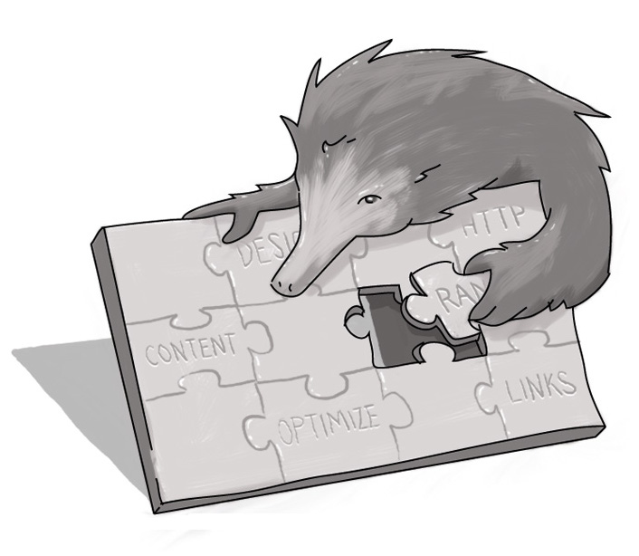
When it comes to truly embracing the COPE ideal, the devil truly is in the details. And by changing your perspective of content from being one monolithic block to a collection of interrelated segments working together, the end result can truly be greater than the sum of its parts when it comes to bringing value to your business.
Identifying all of the components of your content block up front affords you three key benefits:
- It makes it easier for the reluctantly creative to create quality content;
- It reins in the enthusiastically creative and sets marketable boundaries for content creation; and
- It lets you repurpose key content components and messaging in a number of effective – and cost-effective – ways. Not just across your Web site, but across multiple platforms and screen sizes.
Looking at the first two bullets, in most business environments copy creation and curation is generally handled by one of two types: the reluctantly creative (marketers and communications’ types who are either forced to be creative [or, worse, think they’re creative but only speak in Bureaucratseeze]); or the enthusiastically creative (who often can be challenged reining in their prose to meet marketing goals).
By defining clear content segments, copy creation can be improved for both by clearly outlining the expectations and limitations for the content’s creator and/or curator. As I mentioned in Part One of this series, this can eliminate the “What now?” or “Where do I start?” challenges that can paralyze those who aren’t writers by nature, but rather necessity. Conversely, it’s easier to keep ‘writers’ on message when you set limitations.
We then talked about larger content concepts in the last post and how you can use supportive pages to reinforce your brand messaging. Let’s delve into the specifics of content production and discuss further how this can make the third bullet point a reality.
This won’t be a comprehensive evaluation of all your content; nor can it be a one-size-fits-all approach. After all, every company’s content is different, as are your business’ needs. Yet, at the very least, this may help you change your perspective about copy. I outlined a quick list in the last post: titles, body content, summaries, pull-out quotes, captions, sub-heads, bylines, dates, sidebar content… but that’s just the start. Here are just a few examples:
Titles: Oh, how corporate titles vex me, as you may already know. I’ll spend a little more time on this because, beyond the body text, a well-written title is your most important asset.
It’s become almost passé to criticize corporate press releases for their cumbersome titles for overstuffing and lack of creativity. But there is a flip side to this (and a huge caveat) – especially if you have a legitimately creative writer on staff: and that’s falling in love with your own creativity. Sure, that obscure reference may tickle your funny bone, but if it only serves to obfuscate the product or service described in the piece, then you’ve done yourself a disservice.
Conversely, if you slip too far into marketing talk, you run the risk of actively driving your customers away from valuable content. Too often marketing and public relations efforts are neutered by business speak – often in the name of SEO and keyword stuffing – “Startup X’s Scalable, Modular System Combines Shared-Nothing MPP Relational Database with Enterprise-Class Apache Hadoop for Structured and Unstructured Data Co-processing” (this is an actual title, with the company’s name changed to protect the not-so-innocent.)
I’m a sucker for catchy titles and I believe most people share this with me. If not, there are thousands of newspapers, magazines, and on-line aggregators all following some bad advice. Corporately, finding that sweet spot is where success lies.
A successful COPE title will be short, sufficiently relevant to the copy, and interesting. I’m comfortable with titles between 35 and 50 characters, which can be used on Web sites yet fit comfortably on mobile. They aren’t offensive repurposed on social networks and can serve as great lead-ins to newsletter or e-mail text. Especially if you take the time to do the next item...
Teaser Text: This is an incredibly valuable piece of content, whether you’re writing a blog, posting a news item, or building a product page. Character limited to 150-200 words, this teaser (or preview, summary, intro) text serves to provide a little more context and lead-in to the bulk of the content. Some will simply choose to auto-generate this content with the first few sentences of the page content, but that’s a missed opportunity. Easily scanned by the reader, a title/teaser combo can be used for all sorts of marketing opportunities, ranging from Web site content, to newsletters, to social media posting. And if you’re regularly updating your page with products or news items, this is a great way to drive this content to mobile-friendly views.
Think of a magazine: often the table of contents will feature a title and a small overview of the content. Why? Because they know that if you’re short on time you’ll scan through that page and choose what you’re going to read. Introduce your copy like everyone coming to your digital property is short on time. What’s of interest to your reader?
Photos: Setting photo preformats can greatly assist your content curators. Main images, thumbnails, icon libraries – all can serve to let even the most non-techy create visually-rich pages of content. And by enforcing a caption section, you enable repurposing the image alone over various platforms by providing it with relevant context.
And don’t forget audio and video. Embedding videos into pages or linking to podcasts can be made far more easy for the back-end user with a little content managing up front!
Pull-out Quotes: Maybe there’s a key compelling selling message that you want to reinforce? Or perhaps you have a client testimonial relating to your product? By establishing a content field for this type of text, you can style it to add some compelling visuals to break up your text.
Again, go back to the magazine example (I did say, in the first part (http://blog.echidna.ca/article/cope-ing-copy-101-%E2%80%93-long-and-short-it), that COPE allows you to benefit from the best of Old School thinking in a modern application!). Pull-out quotes are the visuals that draw you into the text. Many read them first. And if you have client testimonials to pull from, why not use them to highlight the products and services to which they refer? (And don’t forget to check out my friend and colleague Brian Blatnicki’s piece on how to Get the Most Out of Your Customer Testimonials.) Testimonials integrated into a product page have far more value than a simple list on a page.
Sidebar Content: Do you have content that supports your message? Relevant links? Cross-selling items that you want to highlight? Creating a sidebar field can visually present these items in a way that complements and augments the main copy. And for businesses, that could mean increased sales.
Don't Just Make Your Content Mobile -- Make it Move!
By creating specific blocks, you free up all your content for mobile applications and smaller screens. Instead of creating one big WYSIWYG-y page that needs to be squeezed into a page, you’re giving your designers the flexibility to pick and choose how that content is shared.
For mobile applications, maybe you exclude the sidebars, pull-out-quotes, and other supportive content blocks, focusing only on the headline and teaser (with a link to the full body text). When you’re looking for Facebook posts or building your HTML-based newsletter, you can benefit from ready-made formatting with titles, teasers, and thumbnail photos with captions.
Your content is there and it’s ready to be used – not manipulated. Your content creators have clear guidelines to follow and know what is needed; your designers have pieces of content that upon which they can work their techy wizardry.
And, in the end, your customers get a quality experience no matter where – or on what size of screen – they’re looking at.
As always, we’d love to hear from you. Feel free to comment on this post below. We’re always interested in learning how you create and curate content – and how we can make the process better. After all, small or large business, professional writer or marketer thrown to the wolves – we’re all just trying to COPE with content!
How long should copy be?
What does Create Once Publish Everywhere mean?
What are the basic building blocks of content?
How do I write catchy titles?
SUBSCRIBE TO OUR E-NEWSLETTER
 Subscribe


