Tips to Ensure Your Advertising (or Campaign) Sign Doesn’t Effectively Say “Stop”
It’s election season in our hometown of London, ON -- actually, it’s been election season since May 9th (we just seem to go from one [provincial] to another [municipal], and if that rumoured snap federal election is called, we could be subjected to well over half a year solid of ‘official’ campaigning.)
With that in mind, it seems appropriate to hearken back to the sage words of the boys from our nation’s capital, The Five Man Electrical Band, who once sang, “Sign, sign, everywhere a sign/Blockin’ out the scenery, breakin’ my mind/Do this, don’t do that, can’t you read the sign?”
I, personally, am not a fan of election signs. I consider them civic pollution and firmly believe they should be restricted only to private residences (who have requested them) and not public spaces. But if they’re going to exist, the least I can do is offer some advice as to how to make them work -- because some candidates clearly have no clue.
Best of all, the fundamentals to creating a quality sign apply to creating quality calls to action anywhere -- in print, on a website, or on any media. So read on -- even if politics isn’t your thing!
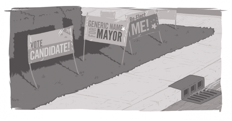
Oh, and to maintain non-partisanship, we will not be showing examples or calling out specific candidates by name. The lesson is more important here than the person.
Know the goal
As much as I don’t like election signs, I understand the reason they persist is because they work. Name-brand recognition is a factor is most elections -- and even more so now that we’ve got ranked balloting. Seeing a sign may not sway the mind of a voter who has done some research, but for more casual voters, it can have a dramatic impact.
The primary goal of any election sign is quick recognition to familiarize the name. Secondary goals can include reinforcing a branding message (a tag line) or a call to action (which could be a web site address.)
One candidate in London has clearly decided to make his or her candidacy about one issue, posting massive signs aligning the name to a particular topic. Will it work? Who knows? But this campaign clearly believes that the voters have one goal -- to either vote for or against a project -- and that will overwhelm any other factors.
Understanding the goal of your tool, allows you to effectively use it. The challenge is when people try to throw the whole toolbox on a campaign sign. A couple of candidates have signs that are far too busy (especially in light of the next part) so that instead of getting all the information, viewers really aren’t able to consume any.
Remember, you likely have complementary tools in your communication strategy. You’re not going to write a novel on your billboard, or spend your 30-second TV spot reading an instruction manual -- you’re going to want something catchy, quickly consumable, and able to refer your readers to better places for more information (e.g. your website or store). Leave the long-winded messaging for door-to-door canvassing, your flyers, or debates.
Accessibility Matters in Every Sense of the Word
Signs need to be accessible and accessible (accessible squared?). Trust me, it makes sense.
First, the vast majority of your audience is likely in a vehicle of some sort (car, bus, bike), and has a limited time and window of attention to consume your message. If I had to pick two adjectives, I’d go with “short” and “visible.”
For one thing, I hope people in vehicles don’t have the time to read longer signs, because if they are, they’re likely not paying attention to the traffic in front and all around them. Knowing that’s your target demo, can help you refine your message. Again, you don’t have to share everything all the time; use your tools as they’re intended.
And as to the other sense of the word accessible, make sure your contrast, colouring, font size, and positioning are accessible to all people. In an election, many of your voters may have visual disabilities -- low-vision, colour-blindness -- or, with an aging population, may have poorer eyesight. Make sure you account for that.
One of the best pieces of advice I’ve heard comes from my wife, who back in her graphic design days, would have someone hold a sign across the room. If she couldn’t read it, then something was wrong. And in this campaign, some of our candidates need to get some better design help.
Driving down a road (again, I won’t say which one, because that will narrow the identity of the guilty party), I remarked -- and grumbled -- on a line of campaign signs. There were four or five candidates represented, often multiple times, but one was extremely challenging to read. Bad colour choice, small text size (even relative to the size of the sign), competing messages and imagery combined to make the most important thing -- the name -- illegible to passing motorists. And this was during the broad daylight.
It seems simple: if people can’t read your sign, they can’t get to know your name. And when clarity and messaging is sacrificed at the altar of style, that’s a poor decision.
Understand referrals
Earlier I mentioned how I don’t agree with election signs on public land. Part of it is that I find it unsightly. Having multiple instances of your sign on a nondescript parcel of land doesn’t impress me.
Again, I get it -- name-brand recognition.
But what’s more valuable to me is what’s proven to be most valuable to consumers of all types -- peer-to-peer referral.
Trust me, I’m more interested in knowing what a neighbour -- whose opinion I may trust and values I may share -- believes than what a few signs littering a nameless/faceless plot of land next to a gas station says.
I’m going to do my own research and form my own opinion, but seeing the opinions of my peers may help to reinforce that decision or cause me to reach out and understand the “why.”
It’s no different than choosing a restaurant. Sure, I may see dozens of billboards, signs, and ads encouraging me to go somewhere, but those pale in comparison to trusted friends telling me, “You’ve got to try this place. You’ll love it because…” and tailoring a response to my needs.
That’s where social interaction and engagement matter. That’s where providing quality products and service to each and every customer matter. So that, in the end, your customers and clients are telling their peers about how your service can be of value to them. And shouldn’t this be the essence of politics -- sharing with others how you’re the best person to represent them and their needs?
Feel free to share your thoughts on signs. And it doesn’t have to be political -- what ads/billboards have caught your attention? What about them appealed to you? And what signs have actively turned you away? Feel free to share on the socials or in the comments below.
How do I design an effective campaign sign?
How do I make a sign that's readable and effective?

Senior Consultant, User Experience & Content Strategy
SUBSCRIBE TO OUR E-NEWSLETTER
 Subscribe
CONNECT WITH US
Thoughts On All Things Digital