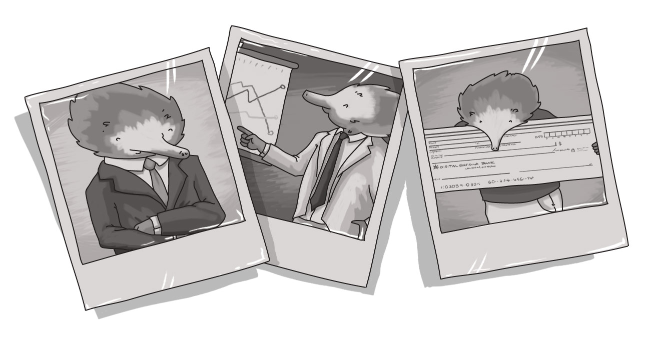
Picture This: The Nine Corporate Photos You Must Never, Ever, Take Again

Just as not all writing is considered equal; nor is all photography. The digital revolution may have made it easier to take photos, but the skill behind producing quality photography has not changed.
Going back to my newspaper days, the challenge for our photographers was to find interesting images on a daily basis for our enterprise shots. These were the over-the-fold images that would serve as a visual hook to people walking by the news racks to entice them to pick up the paper. Despite the pressure to produce an interesting, dynamic, and different image each day, the one thing we insisted upon was that there were no staged shots. I firmly believe that a good photographer can find the magnificent amidst the mundane. And, as with writing, I believe the key is to focus on the people involved in the story.
Just as a good journalist lets his or her interview subjects tell the story, so too should an aspiring photographer learn to let the people be the focus. But that doesn’t mean you have to fall into cliché.
Last week I shared some tips on how to integrate visuals with dynamic content to make your content speak well more than a thousand words. Today I want to point out a handful of photos every business communicator, marketer, or owner should learn to avoid. (And I will be using stock photography sites for examples to protect the [not-so] innocent.) Sadly, with nearly a couple of decades of business communications experience under my belt, I've been subjected to more than a few of these...
THE GRIP ‘N GRIN*: Nothing says spontaneity like a staged handshake photo. You get extra credit if you manage to stage a white-collar/blue-collar coming-together-of-the-masses image.
For many businesses, this is the “Gold Standard” of newsletter copy or Intranet news. After all, what’s more engaging than a CEO or manager handing off a recently printed certificate to a much-appreciated employee? Well, how about a shot of that employee actually doing the thing that earned them the recognition. Take a few photos of the person working (naturally, not staged) and you’ll end up with a much more engaging image to accompany your text.
THE EXECUTION AT DAWN*: Need a staff photo? Want to recognize a department? Line ‘em up and shoot. These photos are wonderful explorations of human nature – what does one do with their hands? How long can one hold a fake smile? Who blinked? Did they go short to tall?
THE BIG-ASS CHEQUE: You can substitute cheque for other items (plaques, certificates, awards), but the result is the same. These can often be combined with the grip and grin (if the item being handed off is small enough).
Generally, this a combination of the Grip n’ Grin and the Execution at Dawn, where the sums are certainly not worth more than its parts. Again, find better ways to frame the image. If the funds are going to a charity, why not take a picture of your employees actually interacting with the recipients of the funds? Building a playground, helping out in a kitchen, playing with kids...
Those images carry far more weight than the card-stock cheque you produced for (and, likely tossed out right after) your photo shoot.
THE YOU POINT/I SHOOT: There is a danger when you hand someone a camera and tell them to “take pictures of people doing their jobs.” You end up with the inevitable staged point-and-shoot shot. You know the one: Employee A, leaning over the seated Employee B, pointing at a monitor; or Foreman A pointing to Joe Hard Hat on a construction site.
Of course, you can earn extra credit if the non-pointer is appearing pensive in some way…
THE OBVIOUS DIVERSITY:
Often, these photos are shot from an overhead perspective, so that we’re sure to see all the people representing all the various ethnicities.
You can play Diversity Romper Room if you’d like. Hold up a mirror, like Miss Jean, and play along, “I see a black man, I see an Asian woman, I see an Hispanic man, I see a Caucasian woman…”
THE DIAMOND DAVE:
Despite evidence to the contrary (as per stock photo sites), my nearly two decades of experience in the corporate world (and media) has resulted in exactly zero examples of suited employees jumping for joy in unison! Yet those responsible for corporate imagery have long taken the words of David Lee Roth to heart and believed that when you want to showcase youthfulness, corporate energy, and business vigour, you "might as well jump!"
The corporate Jump is a close relative of the "finish line" shot.
THE COMPENSATORY BIG DESK:
The big desk. So big you can’t even see where it begins or ends – that’s power.
In an episode of The Big Bang Theory, the importance of a desk – and its relative size – was a key plot point and issue of contention between two characters. The desk itself was a reflection of the value of the person sitting behind it. The big desk equals power.
Some Freudians may want to examine how felling a tall, majestic oak, and transforming it into a large representation of power may be a compensation for something… But I’m more of a fan of Jungian psychology, so…
WHAT DO YOU MEAN WE’RE NOT DIVERSE? WE’RE ALL WEARING DIFFERENT TIES:
Perhaps our 60s-era nostalgia is clouding our vision. There’s an affinity for the suit-and-tie mystique, but those years are being viewed with a certain tinge of colour in the lens. And it’s not rose – it’s 100 per cent white.
For years, the roost has been ruled by old, white, and male. And, in many place those still exist. So what’s worse than forced diversity? No diversity at all. Fortunately, these images are becoming increasingly rare as men and women of all race, creed, and colour are breaking through the glass ceiling to the C-suite.
Yet still you often get the image of multiple white men (and, occasionally a white woman), standing in their matching suits – but at least they’re all wearing different-coloured ties.
And, as you can see, senior management loves its folded arms, which leads us to…
THE WE MEAN BUSINESS; WE FOLD OUR ARMS:
Whether you go solo male, solo female, or you get the whole group together, nothing says, “We’re ready to do business,” than this go-to standard.
While it does solve the whole, “What do I do with my hands?” problem, it also brings up some ingrained beliefs about body language.
People have been taught to believe that folded arms are a signal of defensiveness or closed-mindedness. And while I don’t always believe it (using the “Sometimes a cigar is just a cigar” argument, sometimes chairs don’t have arm rests; and sometimes folding one’s arms is just comfortable), the non-verbal clue is out there for people to interpret.
Plus, it looks pretty silly when a group of you do it. You run the risk of looking like some wannabe B-boy crew at the end of its routine.
THE BAD CORP COMM PARTY GAME!
Feel free to make it a game! Scour your internal publications (newsletters are a great source of bad photography) or industry Web sites and magazines. Play Bad Photo Bingo and award prizes. Reward bonus points for photos that combine multiple versions of the above.
For example, this photo is in a class of its own. If I was one to use the term meta, this would be awesome in its meta-ness. It’s a four-in-one feat (combining Grip ‘n Grin, Execution at Dawn, arm-folding, and staged diversity)!:
CONCLUSION
In the end, don’t stage. Just shoot. I was going to say often, but it’s really ALWAYS – the most interesting images come from people being natural. Think about your family photos. Which are the most engaging? The ones where everyone’s lined up and trying to force a fake smile (“say cheese!”) or the ones that you took without Aunt Sally or Uncle Guillaume noticing?
Invest a little time, effort, and creativity in your corporate photos. The rewards are more engaging content, a more personal touch, and the ability to offer your customers a true window into your world.
Share your experiences with good and bad corporate photography! Feel free to add your comments below (and, of course, links to bad photos are always appreciated...)
* I want to give full credit where credit is due. A couple of these terms were introduced to me by the incredible trio of Mark Ragan, Steve Crescenzo, and James Ylisela, with whom I had the distinct pleasure of attending a conference (and sharing a few post-event beers) nearly a decade ago in Toronto. I am proud and honoured to say that these three men played a key role in defining who I am as a business writer. They made me realize I was not alone in seeing everything that was wrong in corporate communications and got me through many a bang-my-head day in previous work environments.
What are examples of bad corporate photography?
How do I improve my corporate photos?
SUBSCRIBE TO OUR E-NEWSLETTER
 Subscribe


