Key Non-Visual Signs for Visually Impaired Online Navigators

Following Jay's post, I've been thinking a lot about what "sign posts" I use to find my way around a site. In the "real world," I use cardinal directions and street names, the number of intersections between destinations, a number of driveways between a street corner and a destination, or even the presence of a particular tree or mailbox to track my progress and assure me I'm heading in the right direction. But what do I use online?
Many indicators of how a site is to be navigated or used are the same attributes I'd want to make a site usable and accessible to me.
I would hope that any important text could be found by moving between headings on a page. Too many headings and I can't find the meat and potatoes on a site; not enough and I risk missing entire sections. Barring headings, especially on smaller sites, I would hope that skipping to the first instance of non-linked text would give me the basic information I need to use the page. Links from there would take me elsewhere but I'd at least get a sense of the site's content and what to expect while there.
The next step is to evaluate link text. Is it clear where a link will take me? What will happen if I press enter on it with the intention to activate it? "Images/on" is a useless label for a link, especially when activating it changes the label to "images/off" and the rest of the page appears unchanged. I'm left wondering what the point was and am no closer to my destination than before.
Another note about links and headings, more specifically related to digital way-finding than accessibility, is the intuitiveness of the labels given them. I don't read a webpage from top to bottom. I first look at the page's headings (if any), then pull up a list of that page's links. In that list I can navigate by first-letter, meaning that pressing S in this list should take me to links such as "Search". If a link has an unusual label and I'm in a hurry, I might miss it completely. I was on a site yesterday where a link to a related article to the one I was reading was labelled "related [name of article]". I'd been looking for the first word of the name of the article itself, so nearly thought I'd imagined it being there.
My backup plan for oddly-labelled links is a keyword search on a webpage, which some screen readers permit. This does increase my chances of finding what I want. For example, searching for 'contact' would find a 'images/contactus' link label, but trying to find it in a links list would mean reading through every available link on the site, which is a decidedly tedious process. This also assumes that the link label, while odd, at least has its function somewhere in its label, which is not guaranteed.
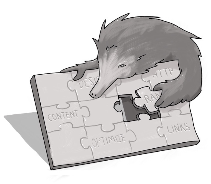
Images won't help me find my way on a website, but their alternative text labels will. Please just be sure those labels say what the image does and not just what it is -- especially if it's intended to add to the context of an article.
While everything so far makes navigation inconvenient and frustrating, improperly labelled or unclear forms can have the greatest real-world consequences. In such cases, where buttons or fields are unlabelled or mislabelled, I risk entering incorrect information. If such a form is a job application or a form for an online payment, the consequences of improper completion can be dire.
In short, online navigation has to work for everyone. Both text and images need to be present, with proper contrast of course, so no user can get left behind.
How does a visually impaired user navigate the Internet?
What are the key items that a visually impaired user needs to navigate a website?

Accessibility Consultant
SUBSCRIBE TO OUR E-NEWSLETTER
 Subscribe
CONNECT WITH US
Thoughts On All Things Digital