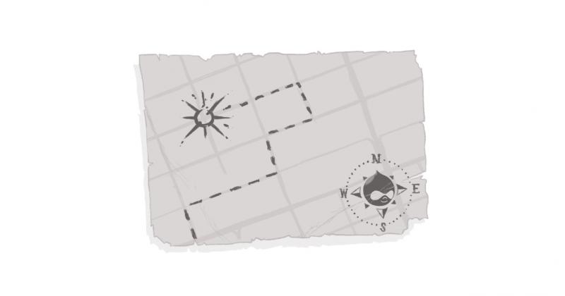
Plotting Your Road Map to Online Success
Every once in a while I'm reminded of the Five Man Electrical Band -- "Signs, signs, everywhere a sign... Do this don't do that, can't you read the signs?"
But what if you can't? How do you deal with it.
Yesterday, I drove my daughter and a couple of her friends to Toronto for a concert. Over the years, I've made more than my fair share of trips up and down the 401. At this point, I figure I could drive to Montreal and back with my eyes closed; and, though I'm not as familiar with Toronto, I know how to get where I need to go.
When you think about it, it's truly amazing that we're able to process so much information, so quickly, when hurtling through life at 125+ km/h (uhm, I mean, 100 -- because that's the posted speed limit). To get to our destination, we take in a tremendous amount of stimuli, absorb and process it, then use it to get to our destination.
It's most noticeable when you're going somewhere you've never been before -- and that's when you appreciate how information is delivered. When I drive to Montreal, I can do it from a sort of mental and muscle memory -- knowing intuitively where I need to go. But when I go somewhere new, I need simple, clear instructions and cues that lets me make decisions quickly.
I can only imagine it's doubly difficult if you don't speak the language. I speak French fluently, but many of my friends have lamented the difficulty they've had figuring things out in Quebec. Trying to get to my old house, they would often take a wrong turn because trying to translate a sign whilst following its directions, and ensuring they don't hit anyone else was a challenge.
So what does this have to do with web design, content, or accessibility? Glad you asked.
Whether we're driving, walking, or navigating a website, we're trying to get to a destination of sorts. And it's important to realize that different people take different routes to get to the same place.
Back in my LookSmart days... in the early days of the Internet, we found that even with search, different people would take different paths. Some used the search box; others preferred to drill down through categories and bread crumbs. That hasn't changed -- and in some ways, it's even more challenging because people aren't just processing information in different ways -- they're accessing it in different ways (tablets, phones, etc.)
Some users will use a 'map' of sorts and pore over every detail of your site. Others are more intuitive and know where they want to go either through experience or expectations. And some need strong visual cues and calls to action to help them identify where they need to go.
It's important to keep in mind that what's intuitive to us may not be the same for someone else. My girlfriend was recently approached by a 70+-year-old client to help teach her how to use a computer. This woman simply wants to learn how to download photos, use Facebook, and keep in touch with friends and family. For many of us those actions are simple and intuitive; for this woman, and others like her, those cues and entrances that we take for granted are completely foreign.
Visuals play a huge component in navigation for many of us. On the road, we can process, in milliseconds, how far the next exit is courtesy of a notification sign that tells us our exit is five kilometers away. Red lights, green lights, yield signs, stop signs, and traffic details are simple, to-the-point, and positioned (through both location and colour) to be in our face and noticeable.
Background noise and extraneous, conflicting imagery -- for the most part -- are minimized on the highway so that we can focus on the messages we need. We're not distracted from our key points of reference -- or, translating to the web, those key calls to action that we need to follow.
To combat any barriers with language, messaging is often restricted to proper nouns (e.g. city names), or accompanied by visual elements that transcend any cultural difference. I'd hazard a guess to say that most people know what that fork icon, the person in the bed, or the tent symbol references.
For most businesses, your site content is not the end destination. It's a path or conduit that is designed to help your customers get where they need to go -- to complete that transactional loop and benefit from the product or service you provide. So while the temptation always exists to talk about yourself and inundate the reader with copy you feel is vital, it's helpful to take a moment and ask whether you're just cluttering up the view? Are you focused on your customers' navigational needs, or are you obscuring the directions with extraneous information?
The signs we notice are often simple, vibrant, and designed to catch the eye through simplicity. It's all about making it easier for your customers to get to their destination.
Now, that being said, I'm completely aware that much of what I'm referring to is visual. So coming up, my colleague Sarah will be sharing her thoughts on what cues people with visual impairments need to help them navigate a site. And, next week, our very own art director Dave Rino will be making his Echidna Blog debut, delivering his insights on the issue!
And, as always, comments are open. We'd love to hear your thoughts on the matter.
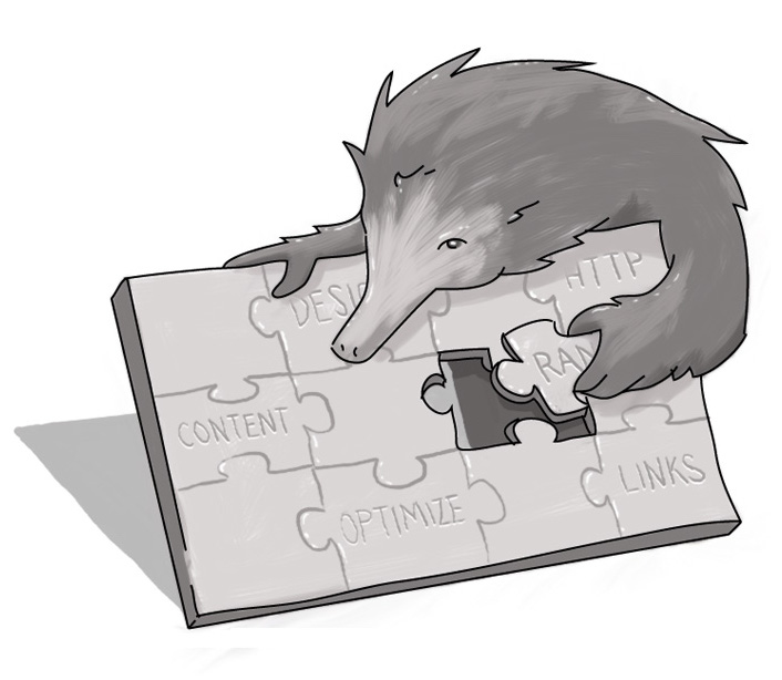
How do I help my customers navigate my site?
How do I design my website?
How do I optimize my site?

Senior Consultant, User Experience & Content Strategy
SUBSCRIBE TO OUR E-NEWSLETTER
 Subscribe
CONNECT WITH US
Thoughts On All Things Digital