How Does it Make You Feel? Why Alt Text May Not Be Enough

The old adage states that a picture is worth a thousand words. Those words, however, are not restricted to just the facts and details – they also convey emotion, feeling, and intent. So how do you make the ephemeral accessible?
In an earlier post, I discussed the importance of accessible infographics and how communicating information in text form is as critical as its picture equivalent. We know though that pictures are not just meant to convey information. After all, no one ever said to Yousuf Karsh – the Armenian-Canadian photographer most famous for his iconic Life Magazine cover photo of Winston Churchill -- "My, what fascinating data your pictures give." So today I'll be discussing the emotional side of online images.
I'll restrict my discussion of images to those meant for commercial purposes – those images designed to sell a brand or product, or images contained in an industry blog or article that are enhanced by text. I hope that readers will consider adopting these ideas into their own personal online portfolios, but having every photo on Instagram described or even properly marked up with alt text is, I fear, an unrealistic wish.
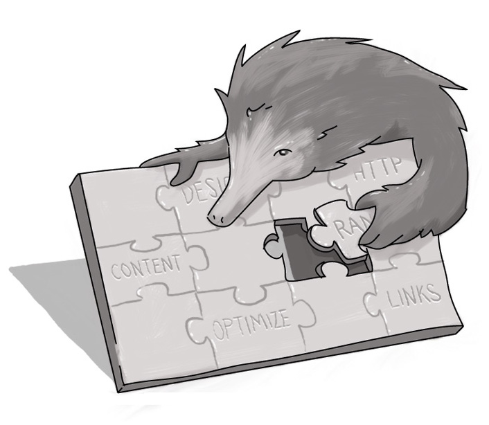
When conveying strict information, such as in an infographic, the shape, colour or impressions of the infographic aren't always necessary to describe. The objective is to provide information and whether it's a bright green pie chart or a black and white histogram, the image itself isn't important as long as the information it contains is provided in an alternative format.
However, if the image is meant to convey a feeling rather than straight facts, its finer details and their specific relevance to the image are essential. If you intend to sell a product, whether it's a vacation spot, your photography skills, your latest Etsy project, or anything else you'd represent as an image online, you need to give the user a sense of what the purpose of your product is.
A "floral pattern" can mean anything from something elegant and pastel to something fun and Hawaiian. And bear in mind that some customers, whether they can see or not, may not get the significance of design features. "A scalloped border" sounds great, but what does it do to the end product? Does it change how it looks? What message does it convey to the person looking at it?
Even if you're using images to enhance an article or blog, but aren't selling anything, this still applies. A picture to enhance your blog or story without alt text or a reference to it in your post can leave a reader confused and wondering what they're missing.
This goes beyond alt text. Of course, having those labels is essential, but keep your main descriptions in the body of your text. As alt text appears as a label for your image, it can't be navigated by word or line. This means that it is read from beginning to end every time it is encountered by a screen reader and can be cumbersome to listen to repeatedly.
For example: "A silver chain with a diamond and platinum pendant" is sufficient for alt text, so long as you follow that up with a piece that describes the chain as "30 cm/1ft of fine silver links with a 2-cm round pendant, suitable for feminine and formal wear." This tells me, as a prospective buyer, that this pendant might be suitable for an elegant female relative; the alt text alone might cause me to pass it up, fearing it was something in the style of Lil Wayne.
Telling an image's story is just as important as showing that image for itself. Descriptions aren't just for the blind's benefit either: they can also benefit those who are not sufficiently familiar with your product(s) to understand what they're looking at.
More means of communication means better business for you. Why not give it a go?
How do I use alt tags in photos?

Accessibility Consultant
SUBSCRIBE TO OUR E-NEWSLETTER
 Subscribe
CONNECT WITH US
Thoughts On All Things Digital