Putting the Info Back into Infographics

Infographics must die.
At least that was the feeling I expressed a few months ago on Twitter. It was a visceral reaction to my frustration with graphical representations of information online.
I was tired of trying to read articles or blog posts whose content consisted of a poorly labelled jpg image that could just as easily been presented as text – text my screen reader could handle. I saw it as lazy and ignorant that people should put up image files with no consideration for anyone who couldn't use them.
But I soon recognized that my reaction was highly immature. Clearly none of these infographic creators meant ill. But it was hard to shake the feeling of being left behind.
I then remembered how often I'd used graphical representations of information rather than words. As an economics student with experience in statistics and calculus, it was often much easier to use a tactile graph to describe concepts, trends, and patterns. So why wouldn't others do the same? And in this semi-digital world, it only makes sense these representations would find their way online.
I sought to find a solution. Perhaps there was an accessibility standard or a means by which text descriptions could be provided. I turned to Google for help.
And Google delivered. I found this article on why making infographics accessible is important, which lead to another article on how to make infographics accessible. Both articles contained examples. It was indeed possible and advisable to create a text alternative for an infographic.
In short, here are two simple starting points:
- Provide a text alternative containing the same meaning and information; and/or
- Use HTML/CSS instead of an image file.
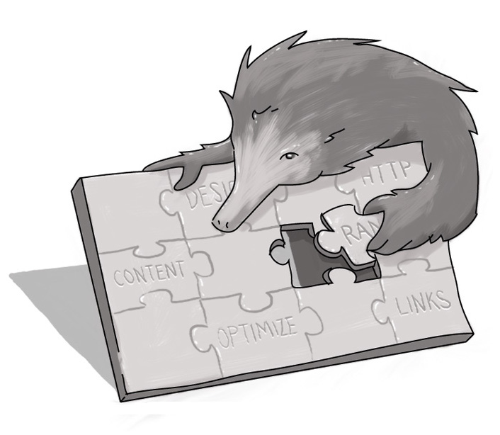
But why should anyone bother? Well it turns out that Search Engine Optimization comes into play. Infographics with text description help SEO because Google now knows what that graphic is and can index it properly. This means that your content ultimately ranks higher in search results than your less-accessible competition.
I no longer have the same resentment towards creators of infographics. After all, pictures are worth a thousand words.
Just be sure those thousand words are a click away for those who need them.
How can I make an infographic accessible?
How can I make an infographic accessible to visually impaired?

Accessibility Consultant
SUBSCRIBE TO OUR E-NEWSLETTER
 Subscribe
CONNECT WITH US
Thoughts On All Things Digital