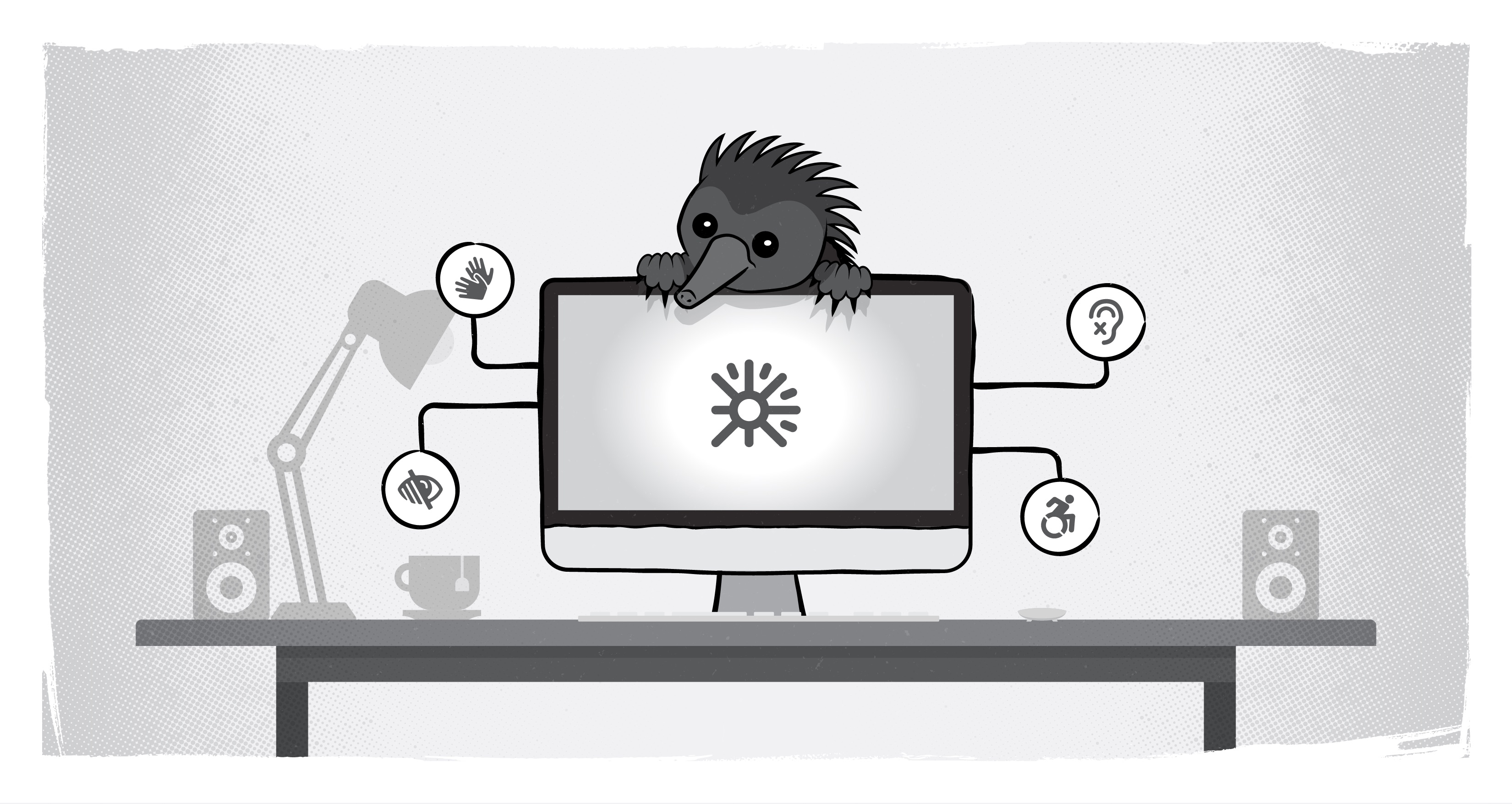
The importance of human accessibility testing

It’s one thing to design with end users in mind. It’s equally important to ensure that all your primary audience has equitable access to that content. One way to do that is to bring people with disabilities in to provide you some real-world, lived experience tests for your digital solutions.
Back in July, I attended Virtual DrupalCon where I watched a session by Jen Sanders. What she said echoes a lot of what we do here at Echidna, when we have clients who really want to invest in accessibility. In both this session and through our own blogs here at Echidna, the importance of understanding the limitations of free and automated testing tools really shines through. Human validation, including experiential testing with people with disabilities, can make all the difference in the success of your project.
Limitations of automated accessibility testing
- misinterpreting Alt-text requirements;
- an inability to check keyboard navigation;
- evaluating screen reader compatibility; and
- providing real-world, actual-use-case understanding of how the site works as a whole.
It’s important to test as you go. Don’t wait until the end of the site to check accessibility as one problem you find on a page can lead to more down the road. It’s easier to fix sites early in the build process, as the longer it goes, the more dependencies are created, and the more challenging remediation becomes.
It’s also important to test the whole product before it is completed and out the door. It’s also best to develop a system that works for how you test, so you don’t miss anything. That could be a checklist or spreadsheet -- and the added advantage is that you now have traceability for your site remediation efforts.
A human accessibility checklist
There are accessibility issues that an automated tool just can’t quite grasp, so it’s important to recruit people with disabilities to help identify any accessibility gaps in your digital experience.
- Contextualize alt-text “errors” -- Alt text is not needed for logos and decorative content, however an automated tester won’t know that.
- Experiential “errors” -- Try your content with a screen reader. Though, by the letter of the law, it may be good, the experience for an end user may not be the same. For example, we had a site that had a table that read an identifier three times. By WCAG standards it was working properly, but it was annoying for users.
- Non-contextual links -- Most scanners will find them, but some links may still be unintentionally vague (without saying “click here” or “read more.” Make sure the link destination is clear in the linked text
- Linguistic barriers -- Most automated scanners don’t evaluate for plain language principles. Ensure universal accessibility by scanning for comprehension. If you’re running for a thesaurus, you’re not accessible. Try using tools like Word’s Flesch-Kinkaid reading score
- Testing keyboard navigation -- Can you move to different parts of a page? Can you access all the menus? Can you click on links to go to different content? Can you use forms effectively with just a keyboard?
Failure happens, accessibility is a continuous journey
One thing to remember is that you’ll need to expect failure. It's okay, it’s normal, and it’s part of the process. Don’t dwell on it, but rather learn from it and move forward. Embrace that you will be corrected and learn the right/better way. And don’t forget to ask for help if you need it. It's okay to say “I don’t know.” Accessibility, in particular, and web design as a whole is a constantly changing field -- you’re always learning something new.
If you’re still not sure where to start, consider booking an accessibility audit with us.
SUBSCRIBE TO OUR E-NEWSLETTER
 Subscribe


