How to Choose the Right Font for Your Project

So, you need to pick a font. Surprisingly enough, this can be a difficult thing to do. The wrong font can turn the most serious of headlines into a farce. You want your pants to match your shoes, or your font to match your brand (or mood, or content, or about a billion other things). Knowing a little more about typography might just save your life (probably not, but just in case)...
Serif versus Sans-Serif
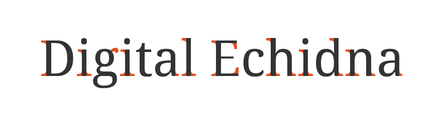
Serif fonts can be identified by the lines extending from it's characters. These feet are called serifs. A typeface without these lines (serifs) is called sans-serif. These two types can be used to identify most fonts. Other types include script, ornamental, and who doesn't love a good blackletter?
Sizing
The ideal font size for print is typically 10 to 12 point. On the web, the most readable sizes are within the range of 16 to 26 pixels. However, these are only recommendations for most fonts. Since the size of characters varies depending on what font you're using, these numbers could be higher or lower.
Leading
Leading (or line height) is the vertical distance between baselines (see Typography 101 below). The common recommendation for leading is 1.5. This is calculated by dividing your line height by your font size. Example: if your font size is 16px, an ideal line height would be 24px (24 / 16 = 1.5)
Measure
Measure is the length of a line of text, measured in characters. Many typographers consider the ideal line length to be 65 characters. Although, anywhere in the range of 40 to 80 characters is safe. Too few and the content becomes disjointed and awkward to follow; too many and the reader could have difficulty finding their position at a new line. Hint: a line's length should be between two and three full alphabet lengths (abcdefghijklmnopqrstuvwxyz)
Faux Weight and Style
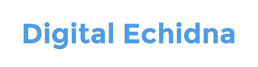
When selecting a weight or style that isn't available for a specific font, the browser will do its best to render a bold or italic version of the font -- a faux bold or italic. These are often dramatically different from the actual weight or styles.
In the above example Montserrat Bold appears in blue; the faux bold appears in red. As you can see, the browser takes some creative license and attempts to recreate a bolder version of the font. Characters appear unbalanced, oddly stroked, and more difficult to read.
Typography 101
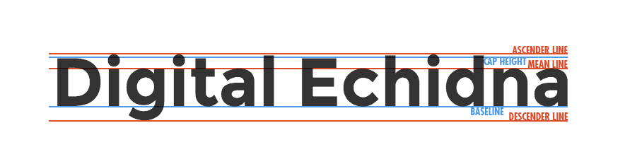
- Baseline: Where most of the letters 'sit';
- Descender: The 'tail' portion of a character which extends below the baseline;
- Mean line: The halfway point between the baseline and the cap height. Rounded characters may break over the mean line slightly to be more visually appealing, otherwise the characters often appear smaller (an optical illusion);
- Cap height: The height of an uppercase letter. Again here, often rounded or pointed characters may break over the cap height;
- Ascender: The portion of a character that extends above the mean line; and
- X-Height: The distance between the baseline and mean line.
Now What?
Now, you're ready to go out and pick the font (or fonts) that are right for you. Easier said than done. The best place to start is choosing a suitable font for your body copy as this is what will make up 80 to 90 per cent of your content. It's recommended to find something that is suitable to your audience and easy to read. For example, avoid script fonts and anything condensed or heavy. Check out some of my personal favourites like Open Sans, PT Sans (or PT Serif), Droid Sans, or Ubuntu.
When it comes to picking the right font for headings, there's a lot more room for creativity as these will typically be used for titles or short headlines. Looking for inspiration? Check out Chad Mazzola's (@ubuwaits) Beautiful Web Type.
And now we turn it over to you. What is your favourite font? How do you choose what's right for your site, document, or logo? Feel free to share your thoughts in the comments below!
How do I choose a font?
What is the right font for my project?
What does serif or sans-serif mean?

Senior Consultant, User Experience & Content Strategy
SUBSCRIBE TO OUR E-NEWSLETTER
 Subscribe
CONNECT WITH US
Thoughts On All Things Digital