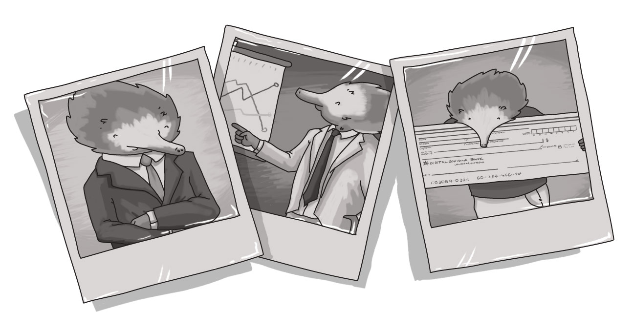
Execution at dawn photos only serve to kill interest, excitement

It goes without saying, but content that's complemented with visuals can dramatically improve its look and feel, not to mention its ability to attract the attention of its audience. We also live in a time where photo taking and video creation, in particular, is easier and more cost-effective than ever.
Images can help humanize content and create a connection with the reader. They can inform and illustrate complex topics or showcase features and benefits far more quickly than mere words. Yet, instead, we get robotic stares and awkward poses.
These aren't still lifes -- these are devoid of all life.
I subscribe to a few e-mail-based newsletters and I recently received one (the sender will remain nameless) that featured three mind-numbing staged photos (the fourth also looked staged, but I'm willing to extend the benefit of the doubt on that one).
Worst of all, they were the all the dreaded Execution at Dawn style of corporate photography.
We've talked about the sins of bad corporate photography before (way back in 2013, I wrote about the nine corporate photos you must never, ever take again), but they still present themselves in publication after publication, ad after ad, and website after website.
I'm not going to focus on the "whats" here -- I want to focus on the opportunities lost.
Photos (and videos) offer you a very prominent opportunity to capture the attention of your reader and draw them into your content. They can help illustrate a concept or create interest. Yet, too often, they're missed opportunities that just a bit of creativity would help maximize.
The Execution at Dawn photo? Where you line 'em up and shoot? What value does that bring to the reader? What in depth appreciation of the content does a rigid line of glazed smiles and wooden body language provide to the reader about what happened at an event? How does a awkwardly posed photo of a meeting's attendees help to convey that all-important "What's in it for me?" message to the intended recipient?
Too often, these are self-congratulatory, self-referential images that those involved feel matter, but really have no impact on your readers. To the picture's subject, it may be ego-gratifying to show who was 'there', but to those who weren't -- presumably the ones who will be impacted by and/or benefit from whatever happened at that meeting -- those photos don't show what's important to them. They know they weren't part of that group, so why not focus on what's of value to them?
Echoing the mantra of a Grade Three math teacher, show your work.
Obviously, you can't always show what's happening in a meeting in a photo (though that's where infographics can come in), you can show action. If you can't show the results, at least you can imply progress through movement. And, at the very least, an image of someone doing something is far more engaging than a statue-like row of people.
It's not hard to do. Anyone can take a good photo (and this is not to undermine the work of photographers -- there is a clear difference between a good photo and a great photo), it just takes the willingness to ensure that someone is tasked with it.
If your meeting, event, or activity is important enough for you to include on your newsletter or in an article, then it's important enough to ensure there's a quality visual representation of it. Task someone with taking photos of the event and encourage them to go after the candids. You can invest in a fairly solid DSLR for around $500. Or you can use your cell phone -- most of them have pretty solid cameras built-in.
You're not out to embarrass people; you're out to show their humanity and passion. Lining people up for a photo automatically makes them look bored. So what message are you sending about the excitement of your project? Show their passion.
Now, there are times when a group shot is valid -- but as a complement to other photos, not as the whole show. Maybe you want to show your company's staff on your website, or show the team at the end of an event. However, those photos should be the minority amongst other, more dynamic content.
But if you wonder why people aren't engaged with your content -- why they're not champing at the bit to check out the next employee newsletter -- maybe it's because you're focusing on the wrong thing. Who attended often doesn't matter; what got done does.
Those staged Execution at Dawn photos? They only serve to kill interest and excitement.
What type of photos should I use on my website?
Should I stage my photos?
SUBSCRIBE TO OUR E-NEWSLETTER
 Subscribe


