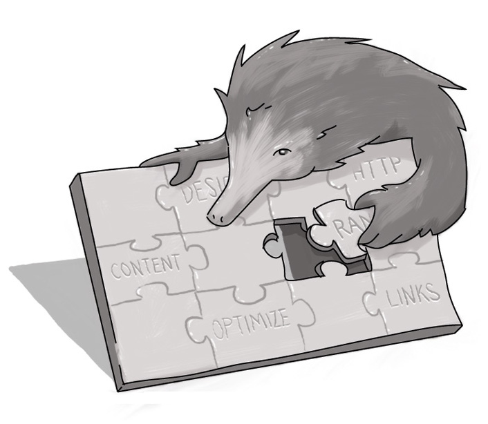
Ensuring Your Accordion Is In Tune With Your Audience, Content
I’m half French Canadian. I married into a family heavy on Newfoundlanders. And I work in the digital field, with a heavy focus on web design. Needless to say, accordions have followed me everywhere.
Just like their off-line inspiration, online accordions can be amazing if they’re applied with skill and forethought. If not, they can render your content tone deaf to the needs of your audience.
Accordions, if you’re not familiar, are online content applications that ostensibly allow content managers to pack a lot of content into a condensed space. They’re often favoured by clients who want to maximize the use of real estate on a page, cramming as much information as possible without overwhelming the user.
Often this is predicated by some antiquated notions of how users interact with content. For example, there’s the idea that people won’t scroll down pages, or a blind adherence to the idea of TL/DR (too long didn’t read.) Before I get to debunking those, let’s focus on the positives.
Accordions -- In Tune
There are a few benefits to accordions. First and foremost, they help keep people on your page. Accordion structures often minimize the need for creating ancillary pages to support content. If there’s no link to other pages, you’re better able to ensure that users don’t get confused by bouncing around a site following links.
In terms of scannability of content, accordions can help as well -- they help to minimize scrolling, they make the page feel ‘lighter’ by hiding bulkier text, and they can provide high-level, scannable context for on-page content.
That is -- and this is a huge caveat -- if the headings used for the closed accordions are intuitive.
Accordions -- Out of Tune
And that’s where the challenges with accordions start. Accordion headings have to be laser focused on the content that comes within. The titling conventions have to be comprehensive enough to provide the user with a solid idea of what context comes within, but not be too long so as to be cumbersome.
Why is this important? Because clicking randomly through content or, worse, clicking to open accordion sections only to find that the content you were expecting isn’t there. This can negatively impact both cognitive load and interaction cost. Your users’ time is valuable -- the more you force them to interact with your content and not receive what they’re expecting, the worse of a user experience they’ll have. And that has a direct impact on their satisfaction with you and your product.
I probably should have started with this, but there are significant accessibility challenges that accordions can bring to the table. From a code perspective, it may not be that big of an additional increase in development cost if you know what you’re doing. But it’s also always better to have someone test them who has some lived experience. As we’ve found, dotting the i’s and crossing the t’s of WCAG 2.0 compliance is one thing, but how someone with, for example, visual challenges experiences the content is often another thing.
Our Sales Engineer, Strategic Alliances, Martin Anderson-Clutz, has two key concerns with accordions:
- Users can’t scan for the content for which they’re looking; and
- If they come to a page from search, the content that matches their search could be hidden, requiring them to figure out or guess where they’ll find it in a collapsed accordion structure.
I share these concerns and feel they can negatively impact findability of content -- the foundation of what we should be doing in terms of creating a positive user experience.
Accordions -- Avoiding Tone-Deafness
Let me go back to my TL/DR statement. I only believe that concept applies if the content isn’t relevant to the reader. And that applies whether you’re presenting 250 words or 25,000. However, if your content is well structured, uses proper visual elements (like effective headers and complementing imagery), and is aligned to the reader’s needs and expectations, they’ll keep reading -- and clicking to continue deeper, whether that’s into an accordion, or to a new page.
The whole “people don’t scroll” thing is pretty passé too. Thanks to our dedication to consuming content on mobile devices, that behaviour has now become an expected pattern in our content interaction. This has extended to desktop environments, where users are far more likely to scroll down for content. And if you can attract those eyeballs with elements that help contextualize the content, then you’re providing your users with valuable information.
A recent study by Nielsen Norman Group looked at scrolling and found that while “above the fold” still attracts the majority of reading time, longer-tail scanning is increasing.
Accordions -- In Harmony
So when should you use an accordion? Obviously, they work really well on mobile thanks to the demands of limited real estate. But they should be used judiciously on desktop presentations. Often it’s better to provide longer pages, with contextualized wayfinding points (such as headers and tags) that allow users to scan for information they need. Or you can consider creating a separate page if the content warrants it. You can run the risk of hiding valuable information, or providing ineffective context when you start applying accordions in an attempt to save space. If space is placed at a premium over context, then you’re creating a negative experience for your users.
Like their off-line counterparts, accordions need context. Just as an accordion may sound great in a traditional French-Canadian “ronde,” it would be out of place in a modern-day rap setting. Knowing where and how to effectively use accordions is key to ensuring your content “sounds” good to its intended audience.
When should I use an accordion on my website?
Do accordions provide a good user experience?

Senior Consultant, User Experience & Content Strategy
SUBSCRIBE TO OUR E-NEWSLETTER
 Subscribe
CONNECT WITH US
Thoughts On All Things Digital