How To Ask Your Visitors For Personal Info

If you're like most businesses, your website is regularly asking visitors for their personal info - as part of a registration, payment, or contact form.
Unfortunately, a significant number of visitors will see your form and, for whatever reason, make the decision to hit the back or close browser button. Reasons could include: The form seems too long; the visitor isn’t ready to purchase, or any number of other reasons.
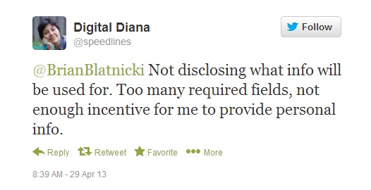
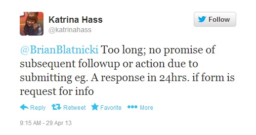
I took to Twitter and a few of my followers gave their explanations:
Every time one of your forms is abandoned you lose a potential customer. So trust me when I tell you that it is in your best interests to make sure as many visitors as possible complete the process.
A lot of talk around forms focuses on button size, colour, and positioning. To an extent these are all very important - tweaking these details can help improve conversions. But In my opinion, there are other very essential considerations to keep in mind:
What's In It For The User ?
A visitor to your business's web site isn’t merely going to hand over his or her personal information just because you've requested - you'll need to offer the user something to do so (something useful or of value). Think of this like an exchange. Your site's visitor will give you his or her name and email address and you give something of value in return.
Each business's return will be something different. It could be a free sample, a free consultation, a coupon, software trial, or a maybe a PDF report.
Once you've provided them with something, your job's not done -- you should reinforce why this was a good trade. This is where your position focuses on value. If your product or service can help solve a business problem for that visitor, then an extra form field or two isn't going to stop them from filling it out.
Understand, you could also have the world's most-simple signup form - simply an email address - and your visitors still won’t complete it if you don’t give them a good enough reason to.
Put some emphasis on what your visitor gets and I think you'll be surprised how quickly you'll notice your signups increasing.
Have You Given Them Proof?
Let's face it, the average business doesn't offer such overwhelming value that a user is going to sign up on right on the spot. There will likely be the need for a bit of persuasion here, particularly if it is the first time someone is visiting your site. You can be certain new visitors don't have sufficient reason to trust you, so you, as the business' owner need to present them with proof.
What kind of proof? That can be in a number of ways: logos from media sources that have covered your company; testimonials from satisfied customers; and any metrics that will help a visitor think positively about your business, product, or service.
What Will You Do With the Information?
A key concern for many people, including Diana who pointed it out above, is what will businesses do with the information provided? Like you, it's safe to assume no one wants more spam or junk email. It may seem trivial or obvious, but telling users that you will never sell their information or send them spam can make a difference.
Consider adding a simple line of text underneath your signup form - “We will never sell or share your email address, ever.” or - “We'll never spam you. And if you don't find this valuable, unsubscribe at any time,” Straightforward statements that add to your trustworthiness. And then make sure you walk the talk and live up to promises.
How Long Will This Take?
As I mentioned earlier the size of your web form shouldn't be your biggest priority. Instead you should focus on conveying and showing proof before you worry about your form's length. But once we’ve nailed your offer, you should certainly look at shortening your form.
Reconsider your form fields. Chances are, the fields you think need to be mandatory really don't.
Once you've removed all unnecessary fields, brainstorm with your web developer(s) to try some nifty design tricks to make the form more appealing. Have your team create an account page that looks like it is an overlay on top of the application. The user will assume that they just need to fill out these four fields and the overlay will close and let them access the site, PDF etc. This also makes it very clear there aren’t additional steps to complete after the form.
Anticipate Any Objections
Review your forms and try to think through any and all possible objections a user may have. Resolve them at each stage. This may include adding some credibility measures, improving your offer, being more clear about what you'll do with a visitors personal information, or shortening the form.
Each and every single time you ask for personal information you will encounter objections, so it’s vital you attempt to think like a visitor to your site.
What stops you from filling out forms? Is there any other things you've tried to work around these problems? Let us know in the comments.
How do I build a good web form?
SUBSCRIBE TO OUR E-NEWSLETTER
 Subscribe
CONNECT WITH US
Thoughts On All Things Digital