Examples of Award-Winning Sites

Let’s take a look at three award-winning sites today, to see beautiful examples of modern design that exercise UX, UI, information architecture, and other tactics, to their fullest potential.
Three Award-Winning Sites
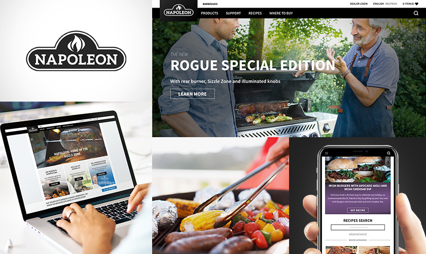
Napoleon Grills
Awards: Acquia Engage Award, Excellence in Digital Marketing // IAC Award, Best Consumer Goods Website // WebAward, Outstanding Website
Napoleon Grills takes its content to the next level with this dynamic and eye-catching site filled with large, high-resolution images and video. Integrated third-party tools -- like Bazaar for product user reviews -- do much of the heavy lifting of the user-generated content that potential customers expect to see before making a buying decision.
The ‘featured’ image you see is not only eye-catching but is connected to a carefully constructed marketing strategy centred on content personalization, which ensures viewers from different countries to see images, videos, and even terminology, that is reflective of their own country’s culture.
This fully responsive, WCAG 2.0 Level AA-compliant solution centralizes the management of all former Napoleon sites and marketing campaigns across several regions and languages. The open-source framework is able to adapt as customer needs evolve and assists the business for growth in both existing and new target markets.
Technology: Drupal 8, Acquia Lift, Acquia Cloud
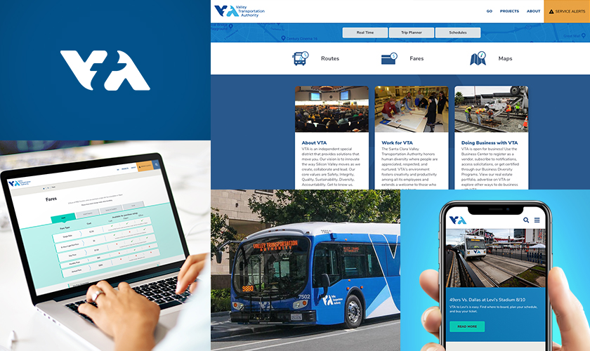
Santa Clara Valley Transportation Authority (VTA)
Award: Acquia Engage Award, Leader of the Pack, Travel & Transportation
Kudos to the Santa Clara Valley Transportation Authority (VTA) leadership, who worked really hard to break down internal departmentmental silos and focus on the needs of its primary audience -- hundreds of thousands of people who use its regional rail service. Its dedication to its users shows in the finished website, which is built and specifically tailored to meet user needs.
An innovative homepage with a three-pane display shows real-time information for next arrivals, a trip planner tool using Google Map APIs, and provides access to schedules listing static bus routes. The integrated trip planner enables commuters to plan start and endpoints of their trip, and displays suggested route info in a logical and user-friendly manner. Service alerts inform of delays or service outages. Several new mapping and online trip planning tools are available for cyclists and pedestrians, too. This site looks great and works best on mobile, which is the tool of choice for audiences who need information on-the-go.
This project included the build of a minimum viable product (MVP) for beta testing, on-going solicitation and collection of customer feedback, the wrangling of real-time data feeds and other Open Data standards, and several product iterations. This is not just a website, it really is an ambitious digital experience that serves real-time information to the users of VTA services.
Technology: Drupal 8, Acquia Cloud
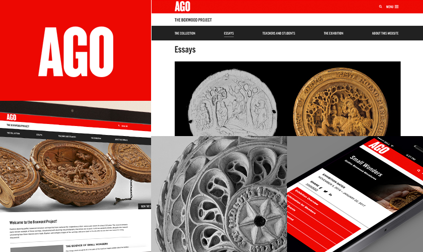
Art Gallery Of Ontario (AGO)
The Boxwood Project
Award: IMA Award, Best In Class
This is not a large site like the two examples I listed above but is an excellent example of a minisite that offers a lot to its visitors, and, for a while now, has been one of my personal favourites.
For a short time in the 1500s, the wealthiest members of the upper class, clergymen and royalty, coveted miniature boxwood carvings. These were considered the ultimate symbol of luxury and status. With no records of who made them, nor instructions detailing how they were made, an inimitable artform was lost to history. Now, some 500 years later, museums all over the world worked together to place all known carvings into one exhibit and used cutting-edge technology to better understand these miniature rosaries, prayer beads, and altarpieces.
AGO’s boxwood website includes a series of functions to engage with each image, such as a deep zoom and scroll functionality, allowing a user to interact with the collection in ways they never could expect to in real life. In the backend of the site, a Collections API synchronizes data within AGO’s collections database system. Site Administration controls allow AGO to publish new content and pages to the site. User Accounts handle how one can register, contribute and manage personalized content. Registered users have access to even more tools such as the ability to save collections of images, add essays, notes and commenting on objects and collections, which aids academic research of these amazing artifacts.
Technology: Drupal 8
What do award-winning sites have in common?
There are tons of examples of award-winning sites out there. Award-winning sites have in common (deceptively) simple, purpose-driven designs and content that connects with and serves the needs of a target audience.
Does your site have what it takes? How would it hold up against these basic criteria?
- Usability: Addresses the needs of its target audience
- Design: Emphasizes simplicity, while keeping it engaging
- Development: Ensures accessibility, mobility, and quickness
- Data delivery: Intelligent, designed-focus
- Navigation: Simple, purpose-driven and intuitive
- Media: Eye-catching and consistent with the content
- Information sharing: Integrative and shareable, responsive
- Content: Relevant and appropriate, clear and concise
Looking for your own website redesign?
Websites cost money -- especially award-winning websites -- and they also cost time. Before you call up your web development partner, consider your goals. Did you want to personalize your website content, like the Napoleon Grills example? Or, make a website that emphasizes the mobile experience while still having good UX on desktops - like VTA? A website that tells a story and fits a niche need with photos, text, or video, like AGO, also resonates.
Whatever it is, if you can put aside your personal opinions on the design and instead focus on serving the needs of your end-user, your website is sure to shine and return on your investment!
What does it take to make an award winning website?
What are some examples of award-winning websites?
SUBSCRIBE TO OUR E-NEWSLETTER
 Subscribe
