A 360-Degree Approach for an Accessible Path to Success

It's easy to pay attention to the big challenges that are right in front of our face, but to get a true view of the issue, you need to apply a 360-degree approach to accessibility.
There was an article yesterday in Toronto's Metro about how AccessNow is mapping accessibility on the 85-kilometre PanAm Path in the Ontario capital using a 360-degree camera. The intent is to help people who use mobility devices get an idea, in advance, of whether or not the trail meets their individual accessibility needs.
We like to think we're doing a good job on accessibility in our province. For the most part, we're making progress, but there's still a long way to go on the path to 2025. And it would be hard to make the argument that we're even half-way there.
There are huge gaps in our infrastructure (the lack of an accessibility standard in education, being a prime example), but those are the easy ones to spot. It's the same web development -- it's easy to spot the big fails and easy fixes.
The challenge comes in the smaller, less-noticeable issues that can create just as much, if not more, of a barrier for those with disabilities.
For an everyday reminder, I invite you to check out David Lepovsky's Twitter hashtag campaign #AODAfail. In it, he asks people to take photos of everyday accessibility challenges they find in their lives and share them on Twitter using the hashtag #AODAfail. For the most part, these fails aren't maliciously created, but many have been created out of a lack of awareness or simple carelessness.
People want to do the right thing, but if it's not right in front of their face, sometimes they'll forget. We have to train ourselves to focus on universal accessibility first, see problems and challenges we may not face ourselves, and design our spaces -- both on-line and off -- with inclusion in mind.
It's why we, at Echidna, try to focus on creating a similar quality of experience for all users. As I've said before, it's one thing to make sure all the WCAG 2.0 "I"s are dotted and "T"s are crossed -- but it's something far more to ensure that your accessible experience provides a similar level of usability, quality, and enjoyment for all users.
Obviously, we can get into the business benefits of accessibility -- from mobile and responsive development to search engine optimization, many of the principles behind accessible design represent best practices for other business drivers. And, as a content guy, I'm always of the opinion that you want to remove as many barriers to people consuming, understanding, and then applying your information.
But, ultimately, taking a 360-degree approach to accessibility is about community. Whether we're talking about a path, a park, an entertainment venue, or a website, we're developing a gathering place for a community. How we design that and how we provide access has a direct impact upon who we're allowing to be a part of that community.
In a trail or a park, a lack of curb cuts or paths that get too muddy can create a barrier to entry. On a website, those barriers can be anything from poor Alt-tagging of photos to a lack of proper semantic markup to even linguistic issues. And many of those issues can be alleviated simply by looking around, seeing what we've created, and seeing if we've created any unnecessary barriers.
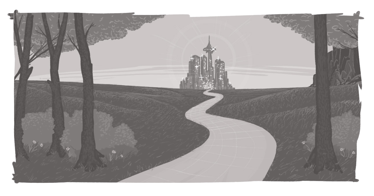
Taking a 360-degree approach to accessibility can help you notice those barriers that may have escaped your attention -- and lead to a clear path to success.
How can I see what accessibility issues my site may have?
What are everyday accessibility challenges?
SUBSCRIBE TO OUR E-NEWSLETTER
 Subscribe


