Experiencing the Web as a Near Totally Blind User - First-Hand Accessibility Part I

I've talked in detail about specific accessibility improvements that affect me directly as a blind computer user. In a new series that I'm starting this week I want to highlight the needs of end-users with a variety of disabilities. Firstly though, I wanted to give a more 'broad strokes' perspective for myself as a nearly totally blind screen reader user.
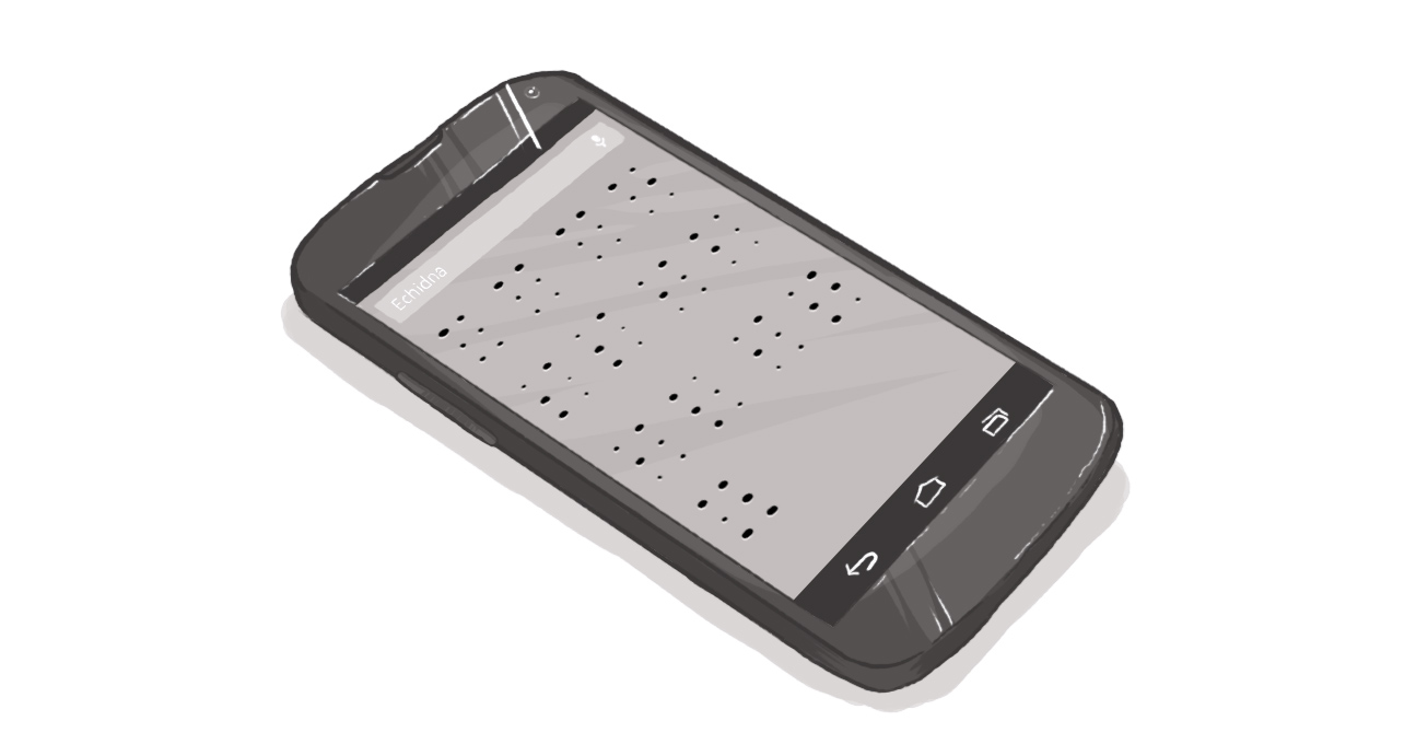
The closest approximation I can give to using a computer as a blind person is to ask you to disconnect your mouse and turn off your monitor. With some instruction you'd be away to the races and using your computer without issue, but you'd quickly become aware of problems.
The one fact of life that can be the most difficult for blind people to accept is that the majority of communication is visual. I don't have a definitive number on hand, but I've heard upwards of 80 per cent. That means people get most information through body language, facial expressions, and the like.
This is of course for in-person communication, but it easily enters the digital realm through the extensive use of photos. Every social network worth anything has a photo-sharing option and some are specifically designed for photos.
Providing good alternative text, or describing infographics are one thing, but getting one's friends to describe their photo library is nearly impossible, not to mention impractical, for them. Describing anything in words is not something most people need to learn.
But impractical or otherwise, it still doesn't always feel fair.
Providing links and headings whose text can be read out of context is another important element on a page for me. With a keystroke, I can pull up a list of links, headings, or form controls. If they are unclear ("click here") or if they don't accurately differentiate between sections on a page (in the case of headings) they aren't much help. Specifying in a link text whether a link will open in a new tab, is a video, or will download a file is helpful too.
Flash in itself isn't bad, but there are too many frames with "Unlabelled 0 button"s for my liking. There is a way to make accessible Flash, but too few people know of its existence or how to use it. A page auto-refreshing is not fun with a screen reader, as I may never get to the text I want without being bounced up to the top of the page every few seconds.
The web is in many ways a game-changer for the blind community. There was a perception, or perhaps it was just my perception, that as soon as everything went online there would never again be an accessibility issue. Everyone would type, so no hand-written notes to worry about and pictures would be properly marked up.
I couldn't have imagined then that pictures of handwritingwould appear online, and bad infographics would be everywhere. The issue I struggle with is patience and compromise: making things usable to me takes time and, sometimes, requires more resources than a company has available.
It's a tough pill to swallow.
But things are changing: I have peers on my school blog writing fantastic alt text. Accessibility is coming up in planning conversations where it never would have before. Digital Echidna is leading the way in providing accessible content. It is these things I must remember the next time I'm raging internally as I try to share files on Facebook.
What's it like to access the web as a blind user?
SUBSCRIBE TO OUR E-NEWSLETTER
 Subscribe


